WinZone: Optimizing the user registration flow
How I turned a complex registration flow into a simple process
Type
Case Study
Role
Product Design, UI/UX Design
Date
January 2024
Context
Imagine you’re a new user visiting a betting platform, excited to place your first bet, but the registration process is long and confusing. This frustration leads to abandonment, and the company loses a potential customer. This was the challenge “Winzone” faced. They needed to streamline their registration flow to reduce drop-off rates and enhance user experience.
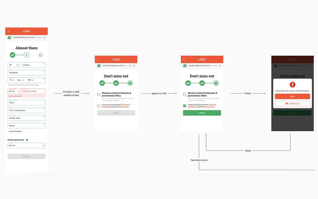
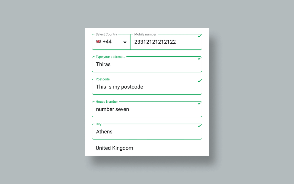
The validation was not reliable: it allowed users to fill the form with any information they wanted and then proceed to the final step just to get an error message without informing of what went wrong.
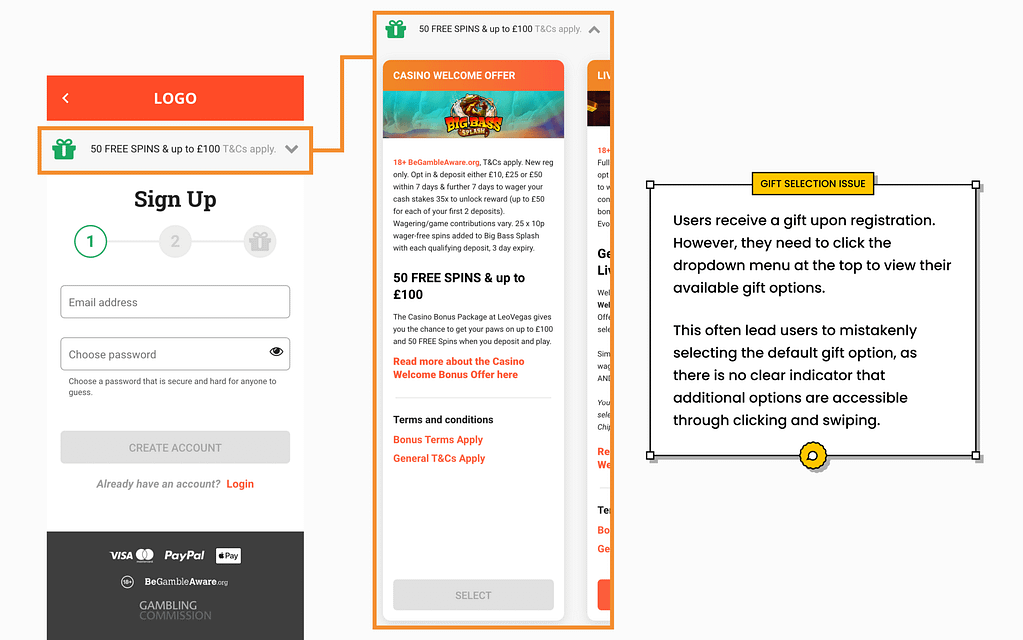
As part of a design review challenge for a Swedish betting company, I was tasked with analyzing and improving the mobile sign-up flow. The goal was to review the current flow, address pain-points and enhance the user experience.
In this FigJam snippet you can see all the steps users had to take on the current site, along with the streamlined and suggested flow.
In this FigJam snippet you can see all the steps users had to take on the current site, along with the streamlined and suggested flow.
Note: The “WinZone” name and logo are fictional and created only to ensure the anonymity of the company I collaborated on this project.
Approach
To address this, I began by closely analyzing the existing registration flow. The process was complex and involved too many steps, which overwhelmed new users. After identifying the key pain points, I focused on simplifying the process by reducing unnecessary steps and making the interface more user-friendly.
Process
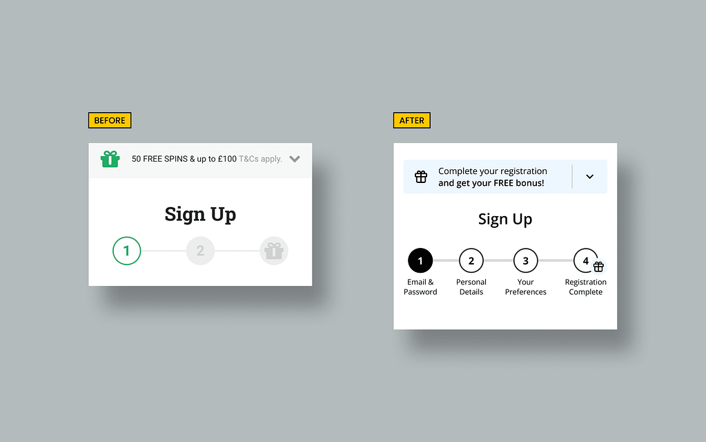
I redesigned the registration form to be more straightforward, ensuring that users were only asked for essential information upfront. Additionally, I improved the overall layout and design to guide users naturally from one step to the next, minimizing confusion. The focus was on creating a seamless experience that encouraged users to complete their registration without frustration.
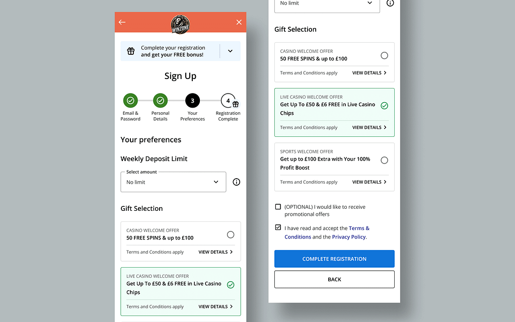
Wireframes of the streamlined flow.
A significant addition to this flow is the “Gift Selection” section at the final step, just before account creation. By placing all gift options there and making the selection process more prominent, the user’s experience is improved, while also creating a sense of reward at the end of the registration process.
The most important issue that I identified though, was the field validation. Although the validation process was fast and often seemed flawless, it failed to distinguish between valid and accurate inputs.
Outcome
The redesigned registration flow set the stage for significant improvements, but its effectiveness still needed validation. I recommended usability testing to observe user interactions, helping to identify any remaining friction points. Creating user personas would ensure the design meets the real needs of our audience.
To gather concrete feedback, I proposed A/B testing the current and new sign-up flows, allowing us to pinpoint what works and what doesn’t. Additionally, I suggested rolling out features incrementally, starting with better error messaging, to assess their impact before implementing broader changes.
Measuring Success
Success would be measured by both business and user-focused KPIs. These include tracking registration completions, user engagement, revenue, and user satisfaction. By monitoring these metrics, we could ensure the new process meets business goals while enhancing the user experience.
Interactive prototype
Please find below a prototype of the final designs and experiment yourself. It is strongly suggested that you use the full-screen option at the top right corner of the Figma snippet.
Thank you!

Get in touch!
If you are interested in learning more about the process and/or the designs, please feel free to reach out to me through my LinkedIn profile.
